Blue Pottery Giveaway: Cobalt Blue in Contemporary and Historical Art

Newer and Bluer Pottery: $600 Giveaway

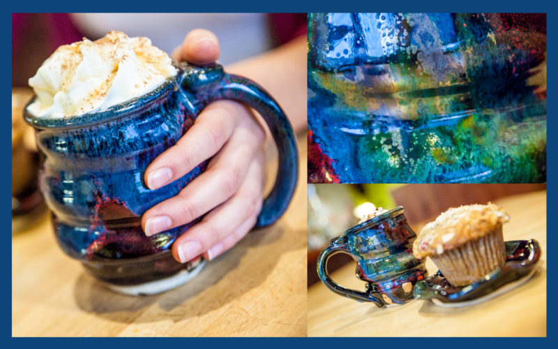
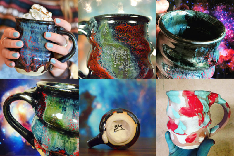
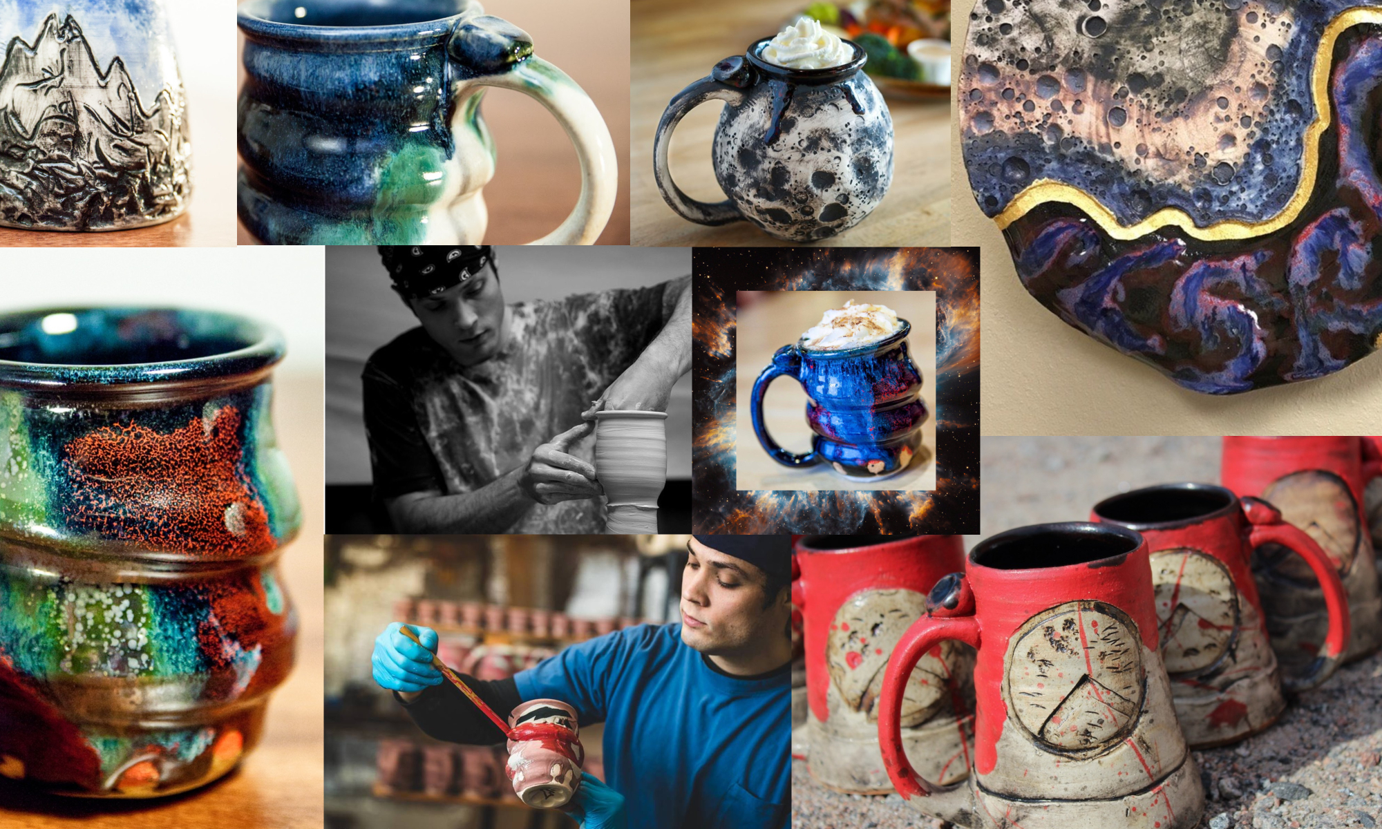
The future of Cherrico Pottery is looking beautifully blue. Joel has been refining his craft and it’s visible in the newest Cosmic Mugs. Meticulous attention to detail by adding a fifth layer of glaze has resulted in amazingly colorful surfaces in his latest batch of pots. These new mugs are all about brilliant blues.

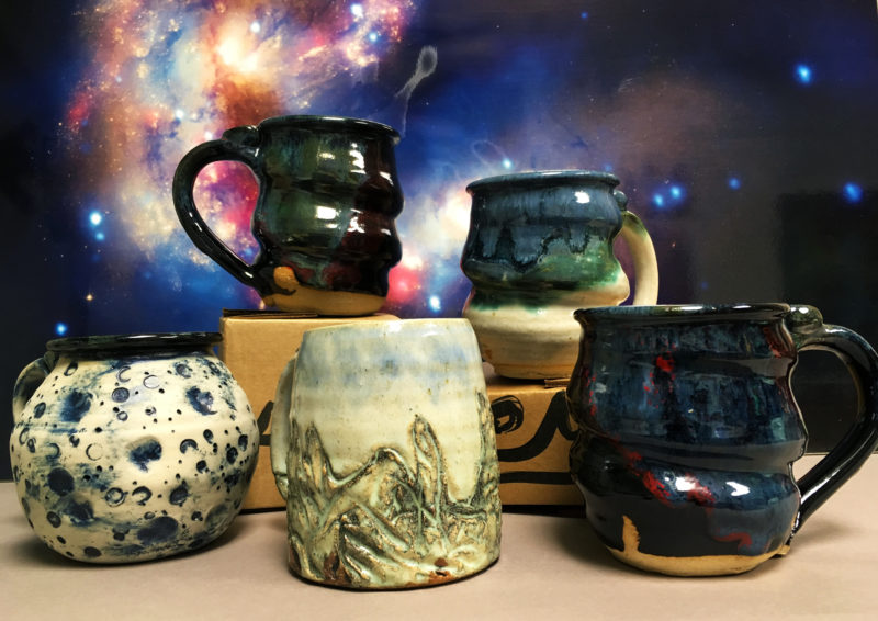
These aren’t the only Cherrico Pottery mugs to show the wonder of deep blue. Cobalt is a common glaze element to decorate bare pots. Cobalt blue gives special surfaces to many of our pots, including the Nuka Cobalt, Blue Moon Mugs and Mountain Mugs.

What’s So Great About Blue?
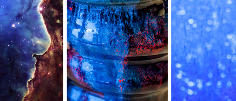
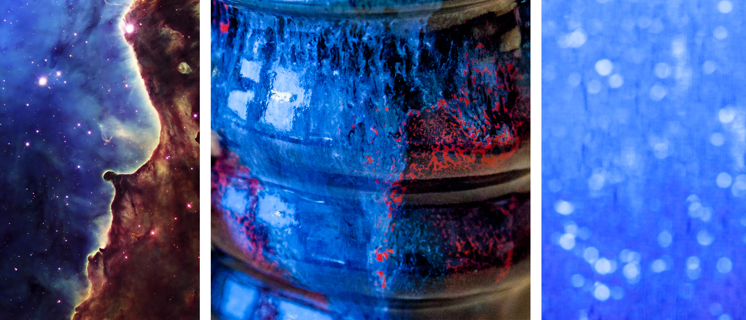
What do you think of when you see a Cosmic Mug? The goal is to resemble nebulae as shown in the left image. Hubblesite.org tells how it was created by ultraviolet radiation and stellar winds from several young stars. Sounds like a rather complex and distant topic. Can we not also see the references to everyday life in these abstract blue drips, like rain collecting on a window, as shown in the right image?

Astrophysicist Neil deGrasse Tyson helps us realize commonalities between outer space and everyday life: “Every one of our body’s atoms is traceable to the big bang and to the thermonuclear furnace within high-mass stars. We are not simply in the universe, we are part of it.

Blue hues in Cosmic Mugs come from Cobalt. It is a rare earth element that is mined all over the world. Five pounds of raw cobalt powder would form just a small pile in your hands, yet it costs hundreds of dollars. It’s the rarest element Joel uses. He combines low percentages of cobalt with other ceramic glaze chemicals like feldspar and silica. After firing to 2400 degrees F. the glaze drips cool and result in deep blue hues.

Don’t worry if you’re a bit confused- so are we. We don’t entirely understand what’s causing these colors, but they are stunning.
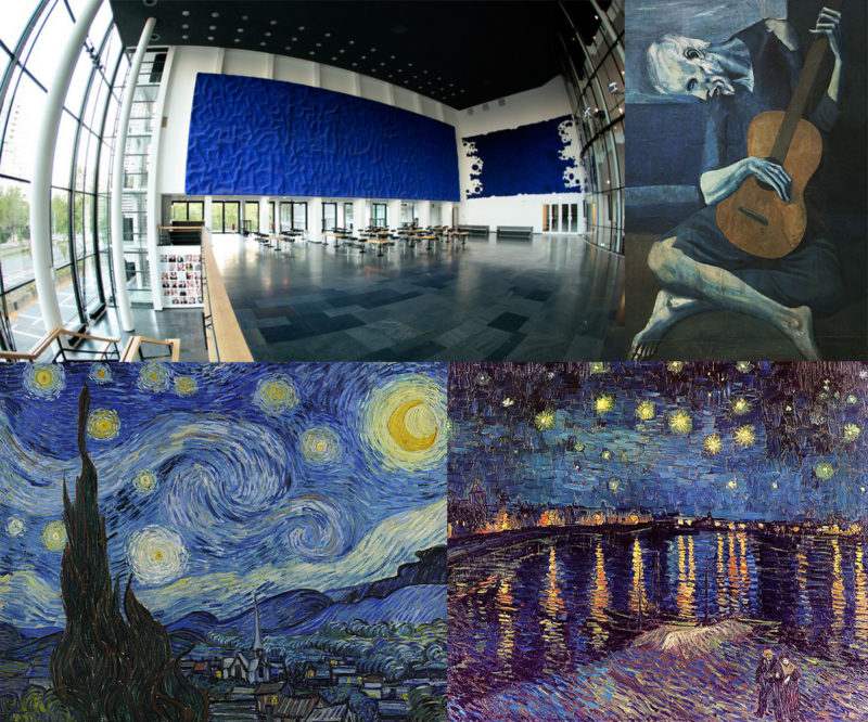
Joel’s cobalt blue pottery is also inspired by notable achievements in art history. These artists championed the color blue in their own unique ways:

  • Yves Klein invented a new hue of blue and used it in large bodies of work that captivated audiences with their brilliance and simplicity.
  • Picasso created essentially monochromatic bodies of work in various shades of blue during what is called his ‘Blue Period’.
  • Van Gogh used nearly ten thousand blue brush strokes per painting without blending in his skies, communicating movement and emotion in unique, new ways.

We want you to feel our love of cobalt blue through our special blue pottery giveaway.

The Big Blue Mug Giveaway

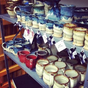
Enter our giveaway for the your chance to win some of our best blue pottery: a brand new deep blue Cosmic Mug, Lunar Cobalt, Nuka Cobalt or Mountain Mug might be in your future. Five winners will be chosen randomly for $600 total worth of pottery. The giveaway ends on November 8th at 5pm. Enter now so you get more time to post the contest to your Facebook and Twitter to gain extra entries.

Random Cosmic Mugs

Our giveaway isn’t the only good deal for you. The Cosmic Mugs in our Random Sale were also brought back from the farthest ends of the galaxies just for you. Stock is going down, so get yours now while they’re still available.

“Blue is the color of longing for the distances you never arrive in, for the blue world.”

– Rebecca Solnit, Author, from the creative nonfiction piece The Blue of Distance

Photo credit: Charles Kremenak

Photography by: Nicole Pederson
Ogres, Princesses, and Pretty Blue Glazes

I remember the first time glazing a pot in Sam Johnson’s ceramics class last year. I had made this slightly uneven coil vase with pockmarked walls nearly an inch thick. The piece was truly ugly, an ogre really, but I couldn’t see the pot as anything other than beautiful. It was my Princess Fiona and I was its Shrek…At least until I glazed it.

Like most naive ceramics students, I pictured glazing just like painting. I picked out a handful of colors using the test tiles as my guide, and then brushed swooping glaze patterns all over my vase. By the time I finished, the pot looked like something straight out a kindergarten arts and crafts class. I on the other hand thought it was a masterpiece – a trophy of abstract art. When the thing (it was beyond a pot at this point) finally came out of the kiln, it was hideous. I looked over at my professor for encouragement. Sam walked over, took one look at my monster, turned to the class and said:

“Opening a kiln can be like Christmas or Halloween. Either the pots look amazing and you fall in love, or the results are horrible and you want to smash everything.”

Kiln Loading 2
The moment of truth, loading a kiln of glazed pots.

Unlike my great clay ogre, Joel can’t afford to make ugly pots. He makes his living through pottery, and as a result, his experiments with glaze need to be calculated and precise. He needs to know exactly how each part of the glaze works; how copper, cobalt, and iron make red, blue, and rust colors when the glaze reacts with fire in the kiln. Glazes transform clay bodies from ogres into princesses. However, as Joel continues to explore glaze chemistry, he finds that these potions are often difficult to create. Like the alchemists I wrote about last post, Joel works tirelessly to find the right balance of form and color that’ll turn a clay body into a beautiful work of art. For his livelihood, each glaze must reach for a certain standard of beauty.

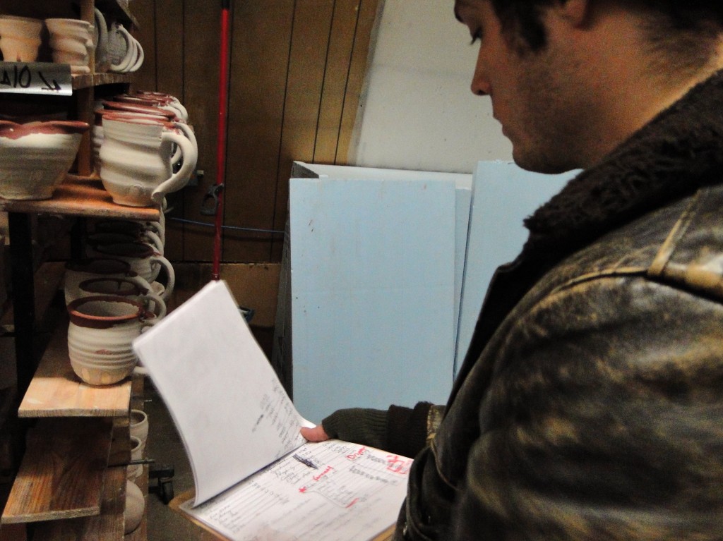
Glaze Notes
– Studying past glaze recipes, tweaking the ingredients to make more alluring pots.

Looking back at his previous body of work, I think Joel’s been chasing this certain type of beauty all along. It’s been hidden in his work throughout the years, and now I feel we’re just starting to uncover it in the color blue.

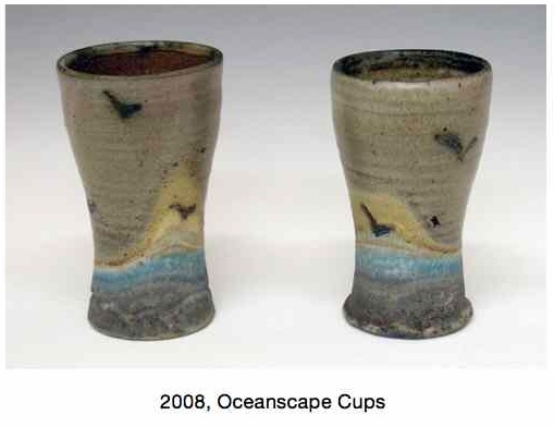
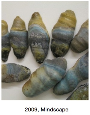
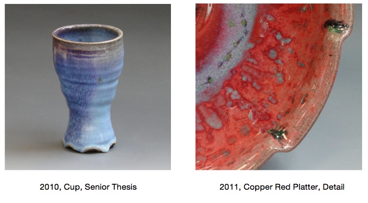
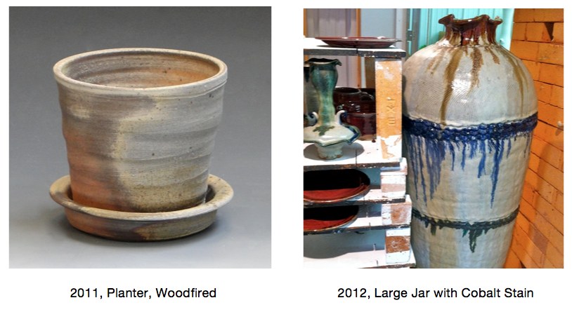
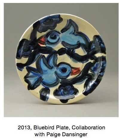
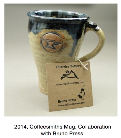
Take a look at the gallery below to see an evolution of this blue color. Even in woodfiring, salt firing and copper red glazes, the color blue shows up. I can track the color throughout his work back to 2008:

2008, Oceanscape Cups    2009, Mindscape

Copper Red Glazes, Salt and REduction Fired, Joel Cherrico Pottery

2011 planter and jar, Cherrico Pottery

Paige Dansinger Collaboration  Collaboration with Bruno Press

Numerous potters talk about the lore of blue pottery. Throughout the ages, potters can’t seem to shy away from it. I’ve heard some contemporary potters even refer to the color as cash-flow blue.

Our text book this semester has been Bernard Leach’s A Potter’s Book. Now a 50 year old text, Leach provides a rich history of how ceramics has evolved. His book not only offers rich lessons of the past, but it also gives insights into the future. But even Leach, who wrote the book after decades of experience under his belt, could not seem to understand the lure of the color blue in ceramics. These stories share his experiences with blue glazes:

“At my St. Ives workshop each summer we are asked by three visitors out of four for colour and yet more colour, blue and the more intense the better, is easily the favourite.”

– A Potter’s Book, page 36

“Yesterday we had a good bunch of people, 2 of whom at least knew a good pot when they saw it. One woman started by asking if we hadn’t got any ‘blue pots’, and when David showed them that the last olive-blue glaze for which we have experimented for years, she said: ‘Oh! Do you call that blue?'”

A Potter’s Book, page 227-228

Perhaps what this all boils down to is something we talked about in the beginning -the pursuit of beauty. Some of the best potters in the contemporary art world don’t make beautiful work. Their work is strange, ugly and confusing.

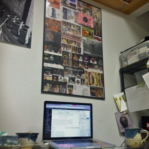
Poster, NCECA, Joel Cherrico Pottery, Handmade Ceramic Pottery, 2014With this in mind, does the color blue still have a place in the contemporary ceramic world? This poster sits above our workspace, and it’s made from postcards Joel picked up in Philadelphia in 2010 at NCECA (National Council for Education for the Ceramic Arts). It gives a snapshot of the contemporary ceramic work, and shows only a handful of simple, blue pots. Joel will be at the conference in Milwaukee next week networking with contemporary potters and pottery enthusiasts. His goal is to show that the color blue continues to have a strong lure in both historical pottery as well as contemporary ceramics. He wants his work to be a bridge between historical potters like Leach and contemporary artists like Paige Dansinger. As a result, we’ve prepared some innovative market ideas, re-designed the website home page, and packed the online store with blue pots and artist collaborations with Dansinger. We’re prepared for the biggest ceramics conference in the country and we’re hoping to lure people to us with our blue pots!

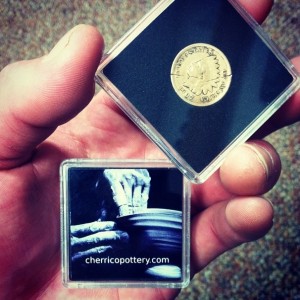
Joel Cherrico Pottery Marketing Ideas, 2014  Joel Cherrico Pottery Business Card Coins

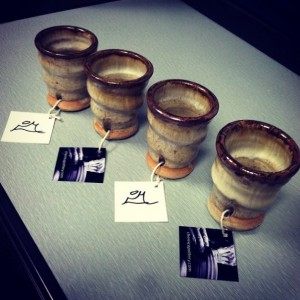
Joel Cherrico Pottery, Shot Cups, Innovative Marketing   Joel Cherrico Pottery, Shot Cups and Mugs, Innovative Marketing

Bernard Leach, A Potters Book, Beautiful Pottery, Joel Cherrico Pottery, 2014
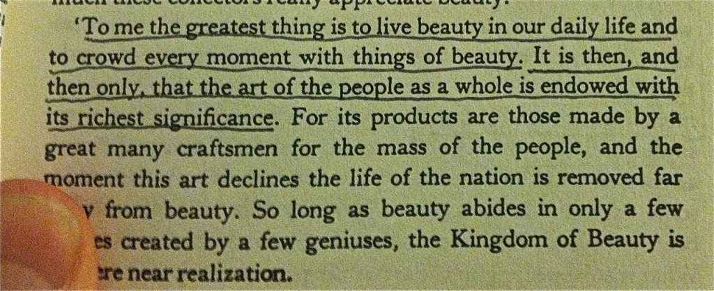
Bernard Leach, “A Potter’s Book” (Page 7)